When choosing a piece of art, one of the more common questions from our clients to our design staff centers around how best to light it. It’s a great question, because if you’re going to invest a sizable amount on a large centerpiece, doesn’t it make sense to spend just a few bucks to light it properly so it can reach it’s fullest potential?
When considering lighting, we like to throw three elements into the mix: 1) the color temperature or Kelvin of the bulb, 2) the angle of coverage or degree spread of the bulb, and 3) a dimmable circuit.
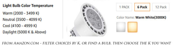
In this installment, we’re going to tackle the color temperature, which is measured in degrees Kelvin, or just K for short. While the K scale goes much further than these numbers, for the purpose of household and office lighting, we’re working in the range of about 2700K – 6000K. Lighting in the lower range of 2700-3200K appears very yellow, while the the higher numbers in the 5000-6000K range appear more white-blue. The most important thing to state here is that there is no right or wrong, and that it’s just personal preference. I personally like very cold white lighting around 5500K throughout my entire house because I feel it’s very clean and contemporary, but many people feel that it makes my place feel cold and sterile, and not particularly welcoming and homey, especially when first coming in from the elevator, which is lit in 3000K. So while contemporary decors tend to use 4000K and up, most traditional or country-style decors tend to be closer to 3000K. The advantages of the more yellowish ~3000K lighting are that it’s arguably a more relaxing feel, it highlights more traditional artwork nicely (particularly darker art with heavy frames and without much blues) and it’s scientifically proven to be easier on the eyes and helps the brain prepare for sleep (think the “Night Shift” mode on your phone). The advantages of ~4000K and up are that it renders clean, true colors in contemporary art and around other features of the home, has a modern flare, and provides mental stimulation and awareness.
So how to choose your bulb? Many bulb manufacturers
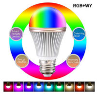
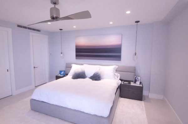
will offer a particular bulb in two or three Kelvin options. Some manufacturers now even make “smart bulbs” with adjustable Kelvin via a remote or wi-fi phone app! One recommendation I regularly make, is that a room should only be lit by one Kelvin. Going into a different room, it’s okay to use a different K bulb, but throughout a particular room, it looks awkward to have floor lamps at 2800K, and 5” ceiling down-cans aimed at the art at 5000K. So while we should stay consistent in one room, there’s nothing wrong with using 3000K lighting in the master bedroom to keep it relaxing when winding down for bedtime, but a whiter 4500K in the kitchen to make that beautiful quartz waterfall countertop and your masterpiece culinary creation look it’s best. That Hog Heaven print that you hung over the dining room table will look great under that lighting too!
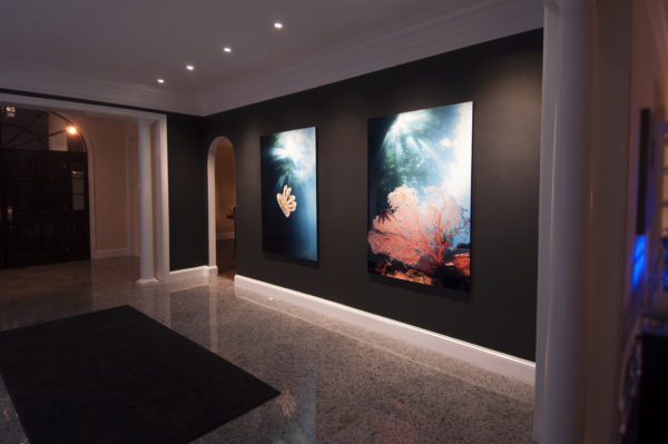
So you come into one of our galleries, and you’re wondering what my art will look like in your home vs. what the gallery lighting is doing. At the Lauderdale by the Sea, FL gallery, we custom designed the lighting from the ground up, so I chose 5000K LED lighting to best highlight my work. That gallery has big windows occupying about 40% of the walls, so not only does it blend well with the natural daylight coming in, but it also looks great after dusk, showing off the art’s generally contemporary feel, and letting the the pieces with bolder colors reach their fullest potential. But if you visit our gallery inside the Fort Lauderdale’s Galleria Mall, you’ll see an eclectic hodgepodge of 2700-6000K made up of numerous types of LED, halogen, and metal halide. That’s all because the mall space was occupied by a jewelry store for 30 years prior to us taking over in 2015, and while the mall doesn’t want me modifying the ancient metal halides, every time one of the 100+ halogens (2700K) burns out, I’m replacing it with a high-K LED, but since almost all the LED’s on the market come from overseas, any particular store on Amazon.com typically orders a few thousand, and when they’re gone, they’re gone, so when you reorder in 6 months, this 6000K bulb from Asia is no doubt a bit different (maybe off by 200K or so), leading to inconsistencies that are only avoidable by over-ordering for the future…..and let’s face it, most of us won’t feel like ordering double the necessary bulbs just to store backups in the closet, right? So anyway, when you’re in our mall gallery, try to not look up and criticize! Actually, there’s a silver lining to our lighting chaos there – feel free to ask the sales consultant to move the piece you want under some old 2700K halogens, under the old 3500-4000K metal halides, and then under the new 5500-6000K LED bulbs. I bet the difference will shock you!
So in conclusion, here’s the takeaway:
*3000K is warmer yellowish; 5000K is cooler white/bluish. Natural sunlight at high noon is 5600K. And it’s nothing but personal preference as to what’s “best”.
*You don’t have to have it absolutely consistent throughout the home, but each individual room should remain consistent with only one color temperature.
*Try a few different K options to see what you like best – for probably less than $5-10 per bulb, you can order (on Amazon, or one of the dozens of lighting specialty sites, for example) 2 or 3 bulbs for a particular fixture in different K ratings. The only way to see what’s best for your lifestyle is to try them out!
In a future post, we’re going to tackle the other two factors: bulb angle of coverage, and dimmers, so look for those tips next time!
Happy lighting!
Love,
-Gug